Device mockups: what they are, and how to make one that looks real
A clear introduction to device mockups: what they are, where they help, flat versus 3D, and the details that make a product visual feel coherent.
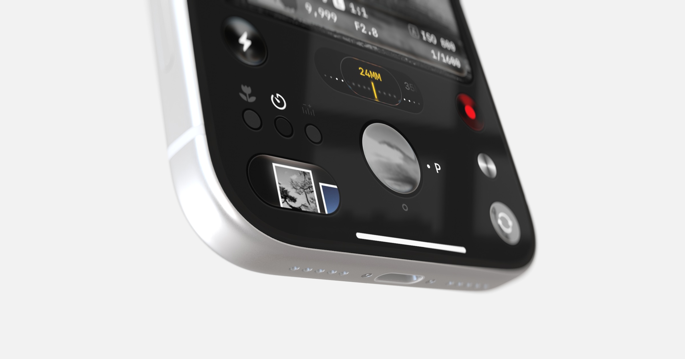
Short answer: A device mockup shows your app, website or interface on a phone, tablet, laptop or monitor instead of as a bare screenshot. A coherent one comes down to four things: perspective that suits the chosen view, lighting that belongs with the background, a soft grounding shadow, and controlled depth of field where it helps. The device should give the screen context without competing with it.
A device mockup is a simple idea done well. Instead of showing only a flat screenshot of your app or website, you present it on the kind of device where it is used. The frame adds context, scale and a physical point of view around the interface.
A bare screenshot communicates the interface directly. A device mockup does a different job: it turns that screen into a composed product visual for an App Store listing, pitch deck, launch or portfolio. Neither treatment is automatically better; choose the one that makes the product easiest to understand.
What a device mockup is
At its core, a device mockup is a composite: your interface, placed onto a device, presented against a background or inside a 3D environment. The interface is often called the screen or screen content. The device is the frame. The background, light and shadow establish the presentation around it.
The purpose of those parts working together is clarity. The viewer should understand the product, the device and the intended context without having to untangle the presentation first.
Where device mockups are used
If you make things for screens, you reach for mockups constantly. A few of the most common places:
- App Store and Play Store listings, where a device frame can provide hardware context around the interface. Our post on App Store screenshots goes deep on this one.
- Website hero sections, where the product shot sets the tone for everything below it.
- Pitch decks, where a mockup can introduce the interface and the device it runs on. More on that in the product slide.
- Portfolios, where a device frame can establish the intended platform around the work.
- Social posts and ads, where the composition needs to work within a specific placement and crop.
- Client deliverables, where a consistent presentation can make the handover feel more considered.
In each case the mockup does the same quiet job: it provides enough context for attention to stay on the work itself.
Flat mockups versus 3D mockups
Flat and 3D mockups solve the same presentation problem in different ways. The right choice depends on the angle, motion and amount of control the final visual needs.
A flat mockup is a 2D asset: a prepared picture of a device with a space for your screenshot. Its angle, light and reflections are already baked into the image. That makes it a direct option when the supplied view already suits the composition.
A 3D mockup uses a three-dimensional device model inside a rendered environment. The camera, lighting and supported reflections can respond to the composition, so you can explore angles and motion that are not present in a fixed 2D asset. See 3D app mockups for a closer look at that workflow.
Here's how the two approaches compare across the things that actually matter:
| Flat mockup (2D) | 3D mockup | |
|---|---|---|
| Camera angle | Fixed to the supplied view | Adjustable around the model |
| Lighting | Baked into the asset | Adjustable within the renderer |
| Reflections | Fixed or absent | Renderer-driven where supported |
| Perspective | Matches the supplied view | Changes with the camera |
| Animation | Possible through 2D transforms and layers | Camera and supported model properties can move |
| Best fit | Direct static compositions | Flexible angles, lighting and motion |
The short version: use a flat mockup when its prepared view already gives you the composition you need. Use 3D when you want to direct the camera, light and motion as part of the presentation.
The four details that make a mockup look real
You do not need to be a 3D artist to make a coherent mockup. Four connected choices are worth checking in every composition.
1. Coherent perspective. Keep the screen aligned with the device and avoid forcing a flat asset far beyond its supplied view. In 3D, use the camera to find an angle that gives the interface enough space to remain legible.
2. Coherent light. The highlights on the device should belong with the background and environment. A soft key light can define the edge without washing out the screen; reflections should support the material rather than cover the interface.
3. A soft grounding shadow. A gentle contact shadow (the soft darkness where an object meets the surface it rests on) anchors the device so it isn't floating. Without it, even a well-lit device looks pasted on.
4. Controlled depth of field. A soft focus fall-off can create separation, but it is not required for every visual. Keep the important part of the screen clear and let the background soften only when it helps. More on this in the small detail that makes a mockup look photographed.
Get those four working together and the presentation feels coherent rather than assembled from unrelated parts.
How to make a device mockup, step by step
The process is short, and the same regardless of which tool you use:
- Export your screen at a good resolution. Higher is safer, since you can always scale down.
- Pick a device that suits the product: a phone for a mobile app, a laptop or large display for a web product, or a tablet for a tablet experience.
- Place your screen onto the device.
- Choose a calm, on-brand background: a solid colour or soft gradient is a useful starting point.
- Add coherent light and a grounding shadow. Use depth of field only when it supports the composition.
- Export in whatever shape and size your destination needs.
Do it once and you have a setup you can reuse. Swap the screen when the product changes, or export the same shot in a new shape for a different platform, without starting over.
Choosing the right device for the job
The device you pick is a message in itself. A quick guide:
- Phone: consumer apps, anything mobile-first, anything you want to feel personal and immediate.
- Laptop: web products, dashboards and tools people use while working. See SaaS launch visuals for a broader presentation workflow.
- Large display: professional and technical software with dense controls, data or a wide layout.
- Tablet: reading, drawing, media and productivity apps with a distinct tablet layout.
- Multiple devices together: to show supported experiences across more than one device, when the product genuinely offers them.
Matching the device to the story helps the viewer place the interface in its intended context.
Frequently asked questions
What's the difference between a mockup and a wireframe? A wireframe is a rough, low-detail layout used while designing. A mockup is a polished presentation of finished work. Wireframes are for figuring out; mockups are for showing.
Are 3D mockups slower to make than flat ones? It depends on the asset and the result you need. A prepared flat mockup can be the most direct route to one fixed image. A real-time 3D tool takes more decisions, but it lets the same setup support new angles, lighting and motion without finding another source asset.
Can I use device mockups in commercial and client work? Commercial rights depend on the tool, the supplied assets and any third-party material in your screen. Check the relevant licence before shipping paid or client work; Ultramock's current terms explain the conditions that apply to its outputs.
Do I need a transparent background? Only when the placement needs it. A transparent export can sit over another layout without carrying its original background, while an opaque export preserves the complete composition. In Ultramock, transparent PNG and WebP export is a Pro feature supported in Chrome; support in other browsers varies.
Which devices should I show my app on? The ones your users actually use, matched to the story you're telling. When in doubt, lead with the phone for mobile apps and the laptop for web products.
Putting it together
That's the whole idea. A good device mockup takes work you have already made and gives it a presentation suited to the story. The craft is mostly in a few connected decisions, then choosing the right device and level of detail for the final placement.
Ultramock brings detailed device models, camera controls, lighting, grounding shadows and multiple composition ratios into one browser-based workflow. The core editor is available for free; Pro adds premium assets and higher-resolution, watermark-free and transparent export options.
Make your product look premium
Your work deserves more than just a screenshot. No download, no account required. Check it out now.
Open editor