How to make App Store screenshots that explain your app clearly
A practical guide to App Store screenshots: plan the first frames, write clear captions, use current Apple sizes, and keep the whole set coherent.
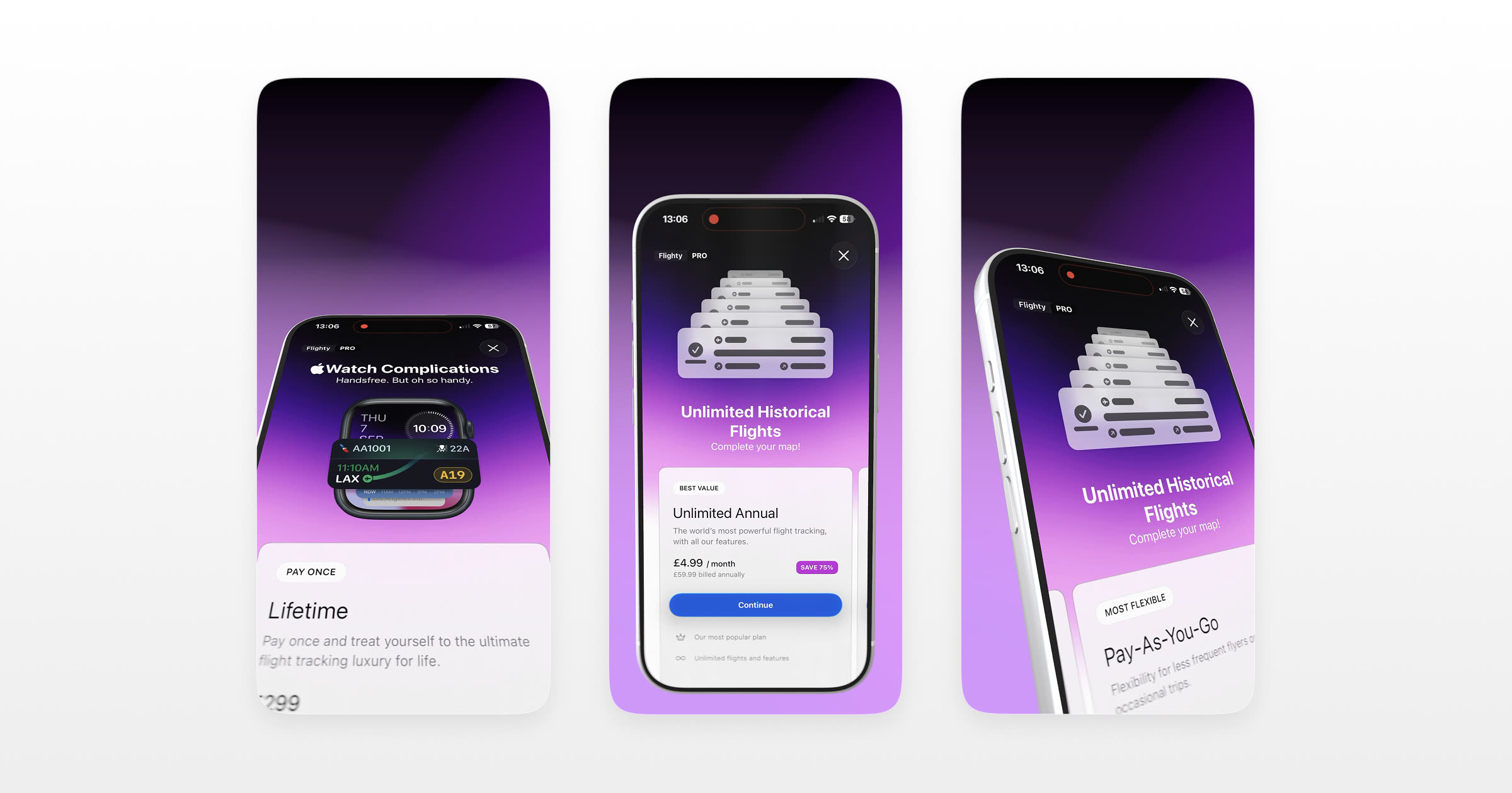
Short answer: Start with the first three frames because they establish the story before someone explores the rest of the gallery. Lead with your app's clearest benefit, show the interface at a useful size, keep each caption to one idea, and hold the set together with a consistent background and visual system.
App Store screenshots are one of the clearest ways to explain what an app does before someone downloads it. The gallery needs to communicate quickly, but it also needs to represent the actual product accurately. Treat it as a short visual story rather than a catalogue of every screen.
A strong set starts with a clear idea of what you want to say and some care in how you show it. This post covers the process, from the story across the frames to the current export sizes Apple accepts.
What App Store screenshots actually do
An App Store screenshot is a marketing image, not a documentation image. Its job is not to catalogue every feature. Its job is to help someone understand the app's value and see enough of the real interface to judge whether it is relevant to them.
Think of the gallery as a compact product story. The opening frames should answer a simple question: what will this help me do? Later frames can add detail without competing with that main idea.
Start with the first three frames
The opening frames establish the message before someone explores the rest of the gallery. Make those first three work as a complete introduction, then use the remaining frames for supporting detail.
A useful starting structure:
- Frame one states the single most valuable thing your app does, as a plain benefit.
- Frame two shows that thing happening: the core screen where the value is obvious.
- Frame three shows what makes you different from the alternatives.
If someone only ever sees frame one, they should still understand why your app exists. Write for that person first, and treat the swipers as a bonus.
Here is how that plan could look for three fictional app examples:
| App type | Frame 1 (the hook) | Frame 2 (the proof) | Frame 3 (the difference) |
|---|---|---|---|
| Habit tracker | "Build habits that actually stick" | The daily check-in screen | Streak insights competitors lack |
| Budgeting app | "See where your money really goes" | The spending breakdown | Automatic categorisation |
| Photo editor | "Studio-quality edits in seconds" | A before/after on one photo | The one-tap preset library |
The pattern holds across categories: benefit, proof, differentiator. Fill in your own specifics and you have a spine for the whole set.
Keep each caption to one idea
Most screenshots pair a device with a single line of text, called the caption. The temptation is to explain everything at once. Resist it.
A caption is not a sentence from your feature list. It's a headline. It should land in the half-second someone's eyes rest on the frame, and then get out of the way so the screen can do the rest of the talking.
Three rules that hold up:
- One idea per frame. If your caption needs the word "and," it's really two frames.
- Lead with a benefit or an action, not a feature name. "Track every subscription" beats "Subscription dashboard."
- Stay legible at thumbnail size, which is smaller than the size you're designing at. Zoom out and check.
Short captions leave more room for the interface and are easier to scan at gallery size. If a caption becomes crowded, split the idea across frames or edit it down.
Show the app on a real device
A flat screenshot shows the interface directly. Placing that screen inside a realistic device frame adds context and can make the set feel more like a considered product presentation. Neither approach is automatically right: use the frame when it supports the story rather than reducing the screen to decoration.
A device mockup presents your screen inside a device frame. A detailed frame can establish scale and context, while a simpler frame can leave more room for the interface. If you're new to the idea, our post on device mockups covers the fundamentals.
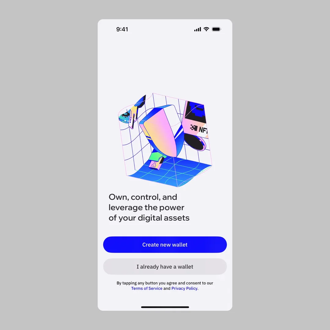
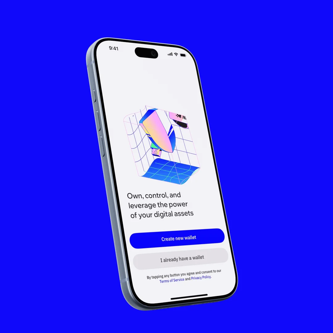
There's a craft point worth borrowing from product photography here. A subtle blur behind the device, keeping the screen itself sharp, makes the frame feel photographed rather than pasted. We go deep on that in the small detail that makes a mockup look photographed, but even a light touch helps.
Make it a set, not a pile
Consistency helps the gallery read as one story. A few choices, held across every frame, do most of the work:
- One background. A solid brand colour or a single soft gradient, used on all of them.
- One angle. Keep the device position and zoom identical from frame to frame so the set reads as a series.
- One tone. Captions in the same voice, the same length, the same rhythm.
When the frames clearly belong together, the set is easier to follow. When every frame changes its angle, background and voice, the viewer has to understand the presentation again before they can understand the product.
A quick test: shrink your set to gallery size and squint. If it reads as one coherent series, you're there. If it reads as a grab-bag of unrelated images, tighten the shared choices before you worry about anything else.
Get the sizes right
Apple accepts one to ten screenshots in JPEG, JPG or PNG format, without transparency. If the interface is the same across device sizes and localisations, App Store Connect can scale the highest-resolution required screenshots down for smaller displays. Apps that run on iPad need a separate 13-inch iPad set. Check Apple's current screenshot specifications before every submission because the accepted devices and sizes change over time.
| Device set | Portrait dimensions (px) | Notes |
|---|---|---|
| 6.9" iPhone | 1260 × 2736, 1290 × 2796, or 1320 × 2868 | Accepted portrait sizes for the current largest iPhone display group |
| 6.5" iPhone | 1242 × 2688 or 1284 × 2778 | Required when a 6.9" set is not provided |
| 13" iPad | 2048 × 2732 or 2064 × 2752 | Required when the app runs on iPad |
Two working principles that outlast any specific pixel count:
- Design at an accepted source size. App Store Connect expects specific dimensions, so start with one of Apple's listed sizes rather than resizing an arbitrary canvas at the end.
- Choose the format for the artwork. PNG is useful for interface-heavy images with crisp text; JPEG can suit photographic backgrounds. App Store screenshots cannot contain transparency.
Always confirm the current required dimensions in App Store Connect before you submit, since Apple updates them as new devices ship.
Then test the first frame
Once the first set is live, test the opening message instead of relying on taste alone. Apple's Product Page Optimization lets eligible apps compare alternate screenshots and review the resulting conversion estimates and confidence in App Analytics.
A reusable setup helps here. Keep the device, background and layout together so a test can change one meaningful variable, such as the first caption or featured screen, without accidentally redesigning the whole set.
Common mistakes to avoid
A short list of choices that weaken the story:
- Cramming every feature in. The gallery is a pitch, not a manual. Pick the few that matter.
- Captions only you understand. Internal feature names mean nothing to a first-time visitor.
- Inconsistent frames. Different angles and backgrounds make a set look accidental.
- Low-resolution exports. Soft or pixelated screens make interface details harder to inspect.
- Ignoring the thumbnail view. If it doesn't work small, it doesn't work.
Frequently asked questions
How many screenshots should I use? Apple allows between one and ten screenshots. Use as many as the story needs, and make sure every additional frame contributes a distinct benefit, workflow or piece of context.
Do I need a different set for iPad? Yes, if your app supports iPad. Build the iPad set from the tablet interface rather than stretching phone screenshots into a different layout.
Should I add captions, or just show the screens? Captions help when they explain what to notice or why the screen matters. Keep them to one idea each, and leave them out when the interface already communicates the point clearly.
Portrait or landscape? Match the orientation to the product. Portrait is the natural choice for a portrait interface; use landscape when the app itself is designed around a landscape experience, such as some games and media tools.
How often should I update my screenshots? Update them when the app's core value, main interface or supported devices change, and when a properly run product-page test gives you a clear reason to revise the presentation.
Putting it together
Get the first three frames right, keep each caption to a single idea, choose a device treatment that supports the interface, and hold the set together with a consistent visual system.
Ultramock can place screens on detailed device models and includes App Store and App Preview output sizes on Pro. The presets prepare the visual at the intended size; always confirm the current requirements in App Store Connect before submitting. Start with the story, then use the tool to keep the presentation consistent.
Make your product look premium
Your work deserves more than just a screenshot. No download, no account required. Check it out now.
Open editor