Depth of field: the small detail that makes a mockup look photographed
Depth of field can give a 3D mockup a more photographic sense of space. Learn what it is, how to shape it, and how to keep the interface clear.
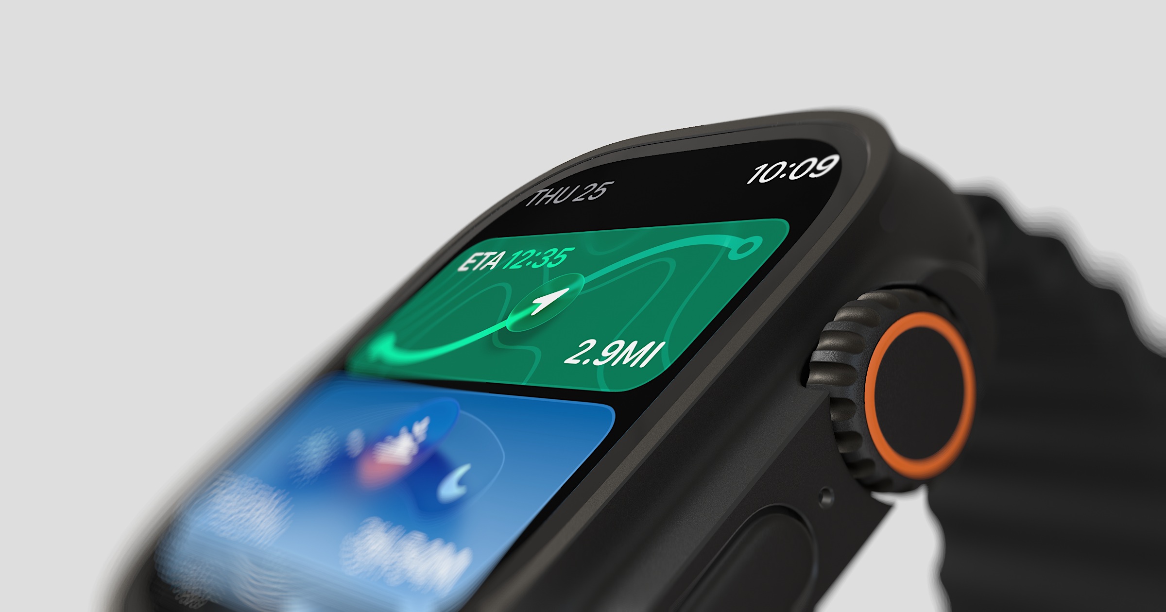
Short answer: Depth of field is the range of a composition that appears sharp, with elements nearer or farther from the focus distance becoming softer. It gives a 3D mockup a familiar photographic depth cue. To use it well, keep the important part of the screen clear, let less important areas fall away gently, and treat blur as part of the composition rather than the subject of it.
Look closely at many close product photographs and notice what is actually sharp. The screen or nearest edge may be crisp while the background softens gradually. That fall-off is one way a photograph communicates distance, and the same cue can bring more depth to a 3D product visual.
A uniformly sharp mockup can feel graphic and precise, which may be exactly right for an interface-led image. A gentle focus fall-off creates a more photographic treatment. The useful choice depends on whether the presentation needs maximum screen clarity or a stronger sense of physical space.
What depth of field actually means
Depth of field is the distance range in a scene that appears acceptably sharp. A shallow depth of field means only a thin slice is in focus and the rest blurs quickly. A deep depth of field means most of the scene stays sharp. A product composition can use either treatment depending on how much of the interface needs to remain legible.
Bokeh is related, but it is not another name for depth of field. Depth of field describes how much of the composition appears acceptably sharp; bokeh describes the character of the out-of-focus areas. You do not need the jargon to make the visual decision, but the distinction is useful when a tool exposes both focus and bokeh controls.
Why a little blur reads as real
A camera lens focuses around a particular distance, with elements outside the acceptable focus range becoming softer. Selective focus is therefore a familiar photographic cue for depth and distance.
Use that cue in a mockup and the presentation can feel more photographic than a uniformly sharp composition. A 3D mockup gives the focus effect real spatial information to work with, while a flat image usually relies on a simulated mask or gradient.
Blur can also create emphasis through contrast between sharp and soft areas. On a product shot, keep that emphasis on the screen or the detail the composition is meant to explain.
The ways to shape focus
Creative tools can shape focus in several ways. These are treatments rather than strict descriptions of a physical lens, so choose the one that supports the composition:
- Around a point: sharp in the middle, softening outward in every direction. This is the classic product-shot look. Keep the screen sharp and let the background dissolve around it.
- Across the frame: focus shifting along one direction, for a more editorial, slightly off-centre feel. Good when you want a sense of movement or depth along an axis.
- In a band: a horizontal strip stays sharp while the top and bottom soften. This gives a clean, high-end catalogue look and suits a device lying flat.
You do not need all of them. Keeping the screen sharp and softening the background is a useful first option when the composition needs more separation.
Here's a quick guide to matching the effect to the shot:
| Look you want | Focus approach | Works well for |
|---|---|---|
| Clean, classic product shot | Sharp around a point | Hero images, App Store shots |
| Editorial, dynamic | Focus across the frame | Social posts, feature art |
| Restrained, catalogue feel | Sharp band | Flat-lay devices, portfolio imagery |
The one rule: less than you think
The most common mistake in this kind of product visual is making the blur more prominent than the interface. Two things to keep in mind:
How quickly sharp becomes soft should feel gradual. A gentle transition looks natural. An abrupt one looks like the device was cut out and pasted onto the background: the exact impression you're trying to avoid.
How strong the blur gets should be enough to separate the device from its surroundings, and no more. If the blur is the first thing you notice, ease it back. The goal is a mockup that quietly feels real, not one that announces its own effects.
At a restrained setting, the blur supports the separation between screen, device and background without becoming the most prominent part of the image.
Depth of field works with the light
Focus and lighting do their best work together. A soft light gives the edge of the device a natural highlight; a shallow focus keeps that highlight as the sharpest, most inviting thing in the frame.
Together, focus and light can separate the device from the background while keeping the screen legible. A soft key light can define the edge; a grounding shadow can stop the device feeling as though it is floating.
This pairing is why the two details are worth judging together. Focus cannot rescue an incoherent lighting setup, and dramatic light does not require heavy blur. Adjust both in service of the interface rather than chasing a photographic effect for its own sake.
A worked example: dialing it in
To make this concrete, here's how to add depth of field to a phone mockup without overdoing it, starting from nothing and stopping at the right point.
Start with everything sharp. Place your device and screen, and look at the flat, fully sharp version. This is your baseline: it will look like a graphic, and that's expected.
Set the sharp point on the screen. Choose where focus is at its crispest and put it on the screen itself, or the near front edge of the device. Then check the full interface, since a shallow focus range can still soften parts that need to remain legible.
Add blur gradually and stop early. Increase the background blur slowly. The moment the device feels separated from its background, lifted slightly forward in space, stop. That point almost always arrives sooner than you expect. If you've reached "obvious blur," you've gone past it.
Check the transition. Look at how sharp becomes soft. It should ease, not snap. If there's a hard line between the sharp device and the blurred background, soften the transition until the fall-off feels gradual and natural.
Compare the adjusted version with the fully sharp baseline. The goal is not to make one universally better; it is to decide which version gives the screen enough clarity while creating the depth the composition needs.
A note on device size
Larger devices often benefit from a gentler fall-off because they fill more of the frame and leave less background to soften. A smaller phone in open space may carry more separation without obscuring the interface. Treat this as a compositional starting point, then judge the result at the size where it will actually be used.
Where to use it
A few practical places this small detail pays off:
- App Store screenshots, to make the framed device feel real rather than pasted. See our post on App Store screenshots.
- Pitch deck product slides, to guide the room's eye straight to the screen. More in the product slide.
- Website heroes and social posts, where a photographic treatment supports the surrounding brand design.
- Portfolio shots, where spatial depth can help separate the interface from its presentation.
Frequently asked questions
Is depth of field the same as bokeh? They're related. Depth of field is the range that's in focus; bokeh is the visual quality of the blurred areas outside it. In everyday use, people often say "bokeh" to mean a pleasing background blur.
How much blur should I use on a mockup? Less than your instinct suggests. Enough to separate the device from the background and no more. If the blur is the first thing you notice, reduce it.
Does depth of field work on flat 2D mockups? You can simulate it with masks and gradients, but a flat mockup has no underlying depth information. A 3D mockup lets the focus effect respond to the spatial relationship between the camera, device and background.
Should the whole device be sharp, or just the screen? Keep the screen and the nearest edge sharp, since that's where you want attention. It's fine, and often better, for the far edge of the device to soften slightly: that's how a real lens behaves.
Can too much depth of field hurt a shot? Yes. Heavy or abrupt blur can obscure the interface and create a visible edge between sharp and soft areas. Start gently, then judge the result at its final size.
Putting it together
A restrained focus fall-off can give a mockup more spatial depth. Keep the important part of the screen clear, judge the result at its final size, and let the effect support the composition alongside coherent light.
Ultramock includes lens blur, focus and lighting controls for shaping this treatment in the browser. Start with a clear interface, then add only the depth the presentation needs.
Make your product look premium
Your work deserves more than just a screenshot. No download, no account required. Check it out now.
Open editor